Visual merchandising mistakes brand managers should always avoid
Analysing potential mistakes in terms of visual merchandising techniques, with a special focus on the beverage industry, can be a useful, profitable way for brand managers and others to avoid them and even obtain better sales numbers.
Put simply, errors can be grouped into three macro categories to help us understand how to do visual merchandising effectively and what to avoid in terms of sales points, product assortment and marketing strategies.
Points of sale
When discussing the advantages and disadvantages of visual merchandising, it is helpful first to focus on the appearance of the store or, more generally, the point of sale overall. Surely everyone has walked into a shop and not had the slightest desire to buy something, regardless of the products being sold.
Start from the basic elements: cleanliness, lighting and product display.
In regards to lighting, it doesn’t simply mean ensuring there are no broken light bulbs. It means that the lighting must be as innovative as possible, enhancing the appearance of the articles being sold and the surrounding display environment.
Lights of varied colours are not recommended as they may create visual distortion. Neutral yet effective lights are best (potentially LEDs) at highlighting each brand.
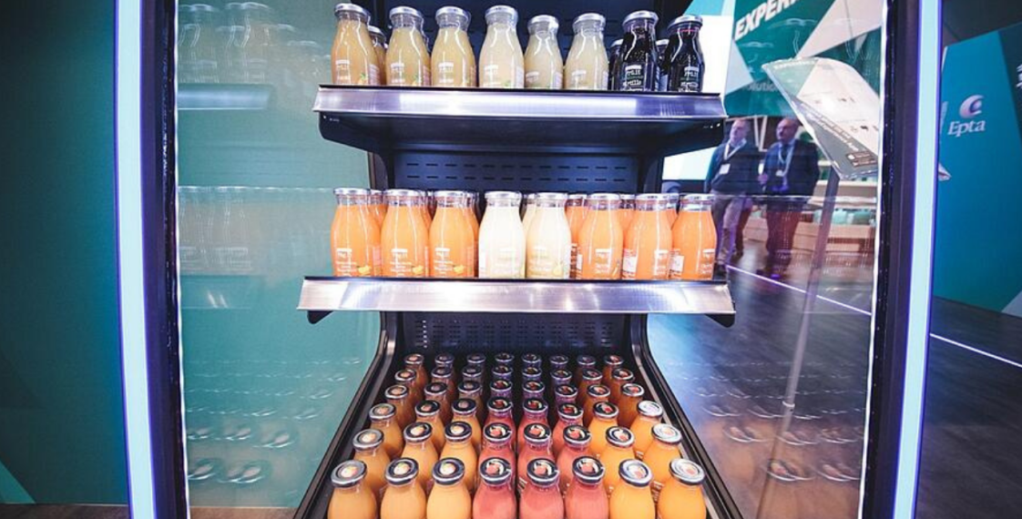
Then there are the sales displays themselves, playing an essential role in boosting impulse purchases. It's important to choose the right refrigerated display, and the beverage industry certainly is no exception.
Display manufacturers have a key role to play here: winning displays highlight the characteristics of the items being sold, potentially with a high degree of customisation, while making the most of the display space.
Product assortment
The rule to follow, according to the most advanced visual merchandising techniques, is to present shelving units that are stocked just in the right way: neither too empty nor too packed with goods. The former is surely worse than the latter, but it is important to remember that a client who finds himself before too many items perceives a visual ‘mess’ that definitely does not encourage impulse purchases.
Another rule to remember is that products at eye level are more likely to catch attention of potential customers. Therefore, displays and shelves must never be left entirely or even partially empty.
In terms of plug-ins, those with small window spaces or little product depth certainly are a critical touch point. Items from multiple brands sacrificed and crammed into tight spaces don’t boost sales according to a principle of “if I see it, I buy it; if I don’t see it, I don’t buy it”.
Marketing strategies
Whatever the size of the shop, its organisation must encourage the customer to maximise his or her purchases. To do so, visual elements take on increasing importance. Flat, anonymous spaces aren't exciting or engaging.. Instead, images and messages coordinated with the identity of the brands being sold will grab the customer’s attention and, along with strategic displays due to their positioning, will help maximise sales.
It is also a good idea to apply the fundamental rules of integrated marketing to visual merchandising and marketing. Otherwise, opportunities connected to external media (internet, television, radio, posters, etc.) and that inside the store won’t be properly exploited, resulting in a lack of optimisation in the sales of a specific brand.